06
Il Pomodoro, Sheraton Hotels
Branding & identity, concept deveopment & menu design
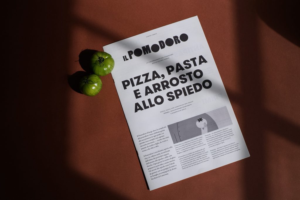


Il Pomodoro is a celebration of the humble tomato where every dish embraces its presence no matter how big or small. Each dish is simple but tells a story — recipes that have been passed down from mother to daughter, neighbour to neighbour and town to town.
The brand and spatial philosophy is inspired by ‘Costas Apertas’, an annual event that takes place in twenty seven villages within the province of Nuoro. Visitors are generously invited by villagers to discover their homes, picturesque alleys, traditional Sardinian weaving and cooking conventions.
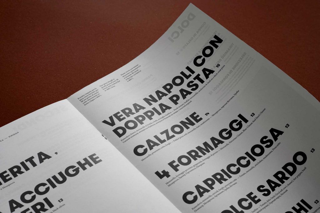
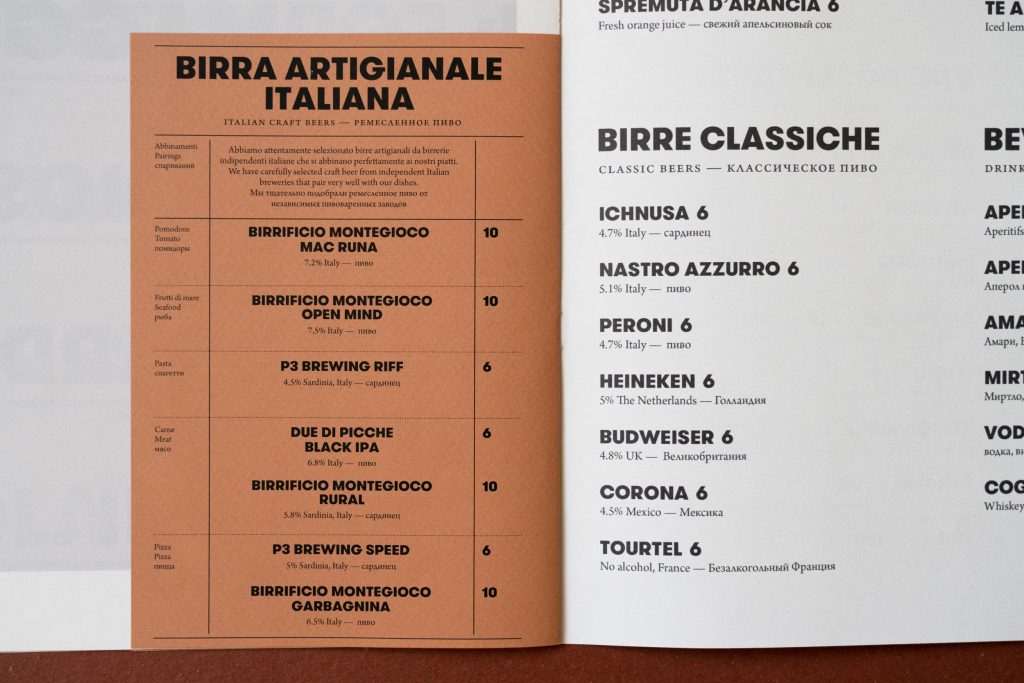
The newspaper menu format is an experimentation between classic and contemporary, playfulness and restraint while offering a sense of homeliness and familiarity. The design borrows visual cues from 1950s Sardinian newspaper L’Unione Sarda. Italian illustrator Sofia Sita was commissioned to create expressive illustrations using black and grey felt tip pens to permeate each section and provide soft visual retreats against the bold typography. The menu is typeset in English, Italian and Russian for a cosmopolitan audience.
CLIENT
Sheraton Hotels & The Luxury Collection
COLLABORATORS & CREDITS
Spatial philosophy in collaboration with Sarah Wakefield & Simone Lockley
Illustration by Sofia Sita
Project delivered at Blacksheep